Explaining health science is one thing. Helping people reconsider risk is another.
Animation can build knowledge in complex subject matters such as health. But helping people reconsider risk takes more. It requires understanding their assumptions, clarifying comparisons and supporting decisions.
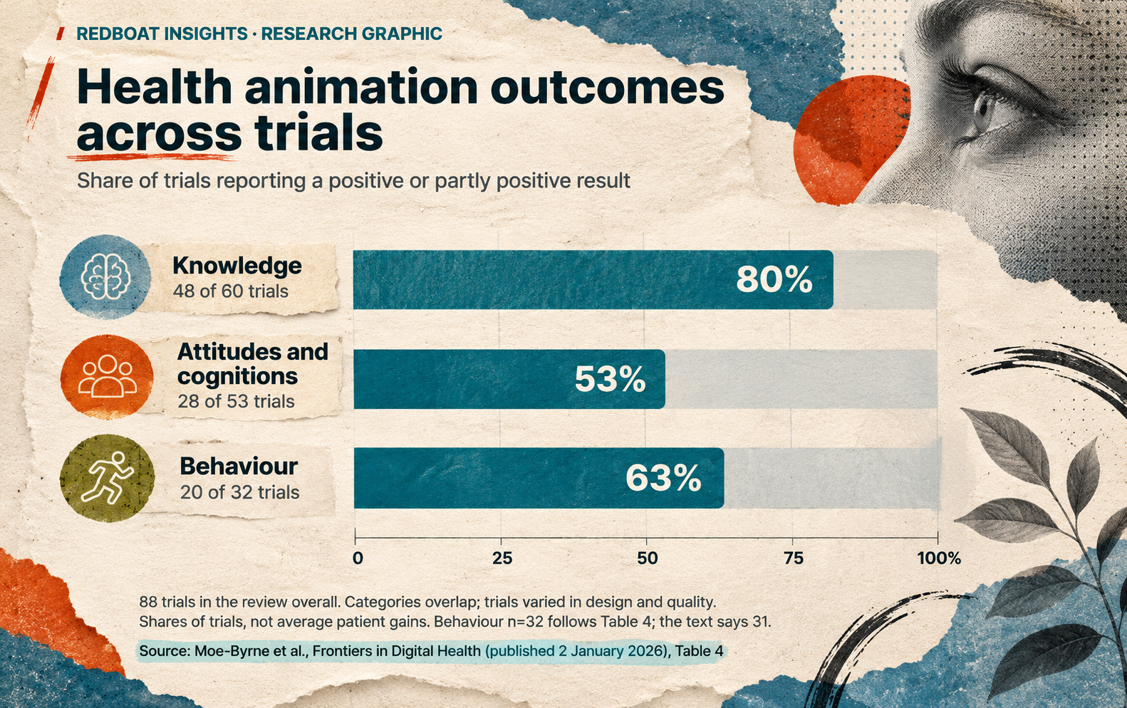
A systematic review published in 2026 examined 88 controlled trials of health animations involving approximately 37,900 people. Positive or partly positive results were reported in 80% of trials assessing knowledge (48 of 60), 53% of trials assessing attitudes and cognition (28 of 53), and 63% of trials assessing behaviour (20 of 32). [1]
These findings provide good reason to consider animation when communicating complex health information. Improvements in knowledge were reported most consistently, but the research also demonstrates animation's potential to influence attitudes, cognition and behaviour.
Clear information is not always enough
Health decisions involve more than understanding medical information. People also draw on their experiences, beliefs and expectations about what will keep them safe.
Recent Australian research illustrates this challenge. In four focus groups involving 28 adults, researchers explored attitudes towards using genomic information to personalise cancer screening.
Most participants said they would accept more frequent screening if assessed as being at higher risk of cancer. But many were reluctant to reduce screening if assessed as lower risk, even when a reduction was presented as the recommended approach. [2]
Why might this be? One reason is the widespread assumption that more screening is always safer. Yet additional screening can also cause harm. It can produce false alarms, lead to unnecessary investigations or detect cancers that would never have caused problems. Some participants in the study had limited awareness of these risks.
The study highlights two challenges for health communicators. The first is explaining the science clearly, including both the benefits and potential harms of screening. The second is helping people reconsider established assumptions about what makes them safe.
Animation could potentially help with both. It can explain how screening works, but it could also use visual stories, metaphors and analogies to show why more screening is not always better, and why the appropriate decision may differ depending on a person's risk.
The study illustrates why communicating health risks may require more than simply presenting accurate information.
When adding movement isn't enough
Does animation help people understand risk better than static images? A 2019 study involving 187 participants explored this question using information about colorectal cancer screening.
The researchers compared three ways of presenting the same information: an audio presentation accompanied by static graphics, a video using static graphics, and a video using animated graphics. The graphics used repeated icons to represent probabilities, such as highlighting 10 people out of 100 to illustrate a 10% risk.
In the animated version, icons were highlighted, flashed or moved to draw attention to the numbers. But the researchers found no statistically significant improvement in participants' understanding of risk compared with the static versions. [3]
A broader review published in 2024 also found insufficient evidence that animating numerical risk graphics improves understanding, risk perception or health decisions compared with static graphics. [4]
These findings don't mean that animation is ineffective for communicating health risks. The studies examined relatively simple animated graphics, not the wider possibilities of explanatory animation, such as visual storytelling, analogies or showing how medical decisions are made.
They do, however, raise an important question: if making information move isn't enough, what is it about animation that does help people understand and reconsider risk?
Here are three evidence-informed approaches worth exploring and testing.
1. Find the assumption before drawing the explanation
Before developing an animation, find out how the audience already understands the issue. People may assume, for example, that more testing always means greater protection. This belief has some basis in reality, but overlooks the potential harms of unnecessary testing.
Research into risk communication has long demonstrated the importance of understanding how audiences already interpret a risk. The mental models approach, developed in the 1990s, provides a method for identifying gaps and assumptions in people's understanding and designing explanations that address them. [5]
An animation could then show two ways of thinking about screening side by side: “more tests mean more protection” and “the benefits and potential harms of screening depend on a person's risk.” By illustrating the reasoning behind each, including the evidence and uncertainties, animation could help viewers reconsider their assumptions without dismissing their concerns.
As the Australian study suggests, reluctance to reduce screening may also reflect legitimate personal preferences or concerns that better explanations alone cannot resolve. [2]
2. Show the relationship behind the number
Percentages can be misleading without context. A 10% risk, for example, means something different depending on whether it applies over the next year or over a lifetime. Similarly, a 30% increase in cases might sound alarming, but if that means an increase from 100 to 130 cases in a population of 100,000 people, the absolute risk has risen only from 0.10% to 0.13%. Understanding risk also means considering the potential benefits and harms of different decisions.
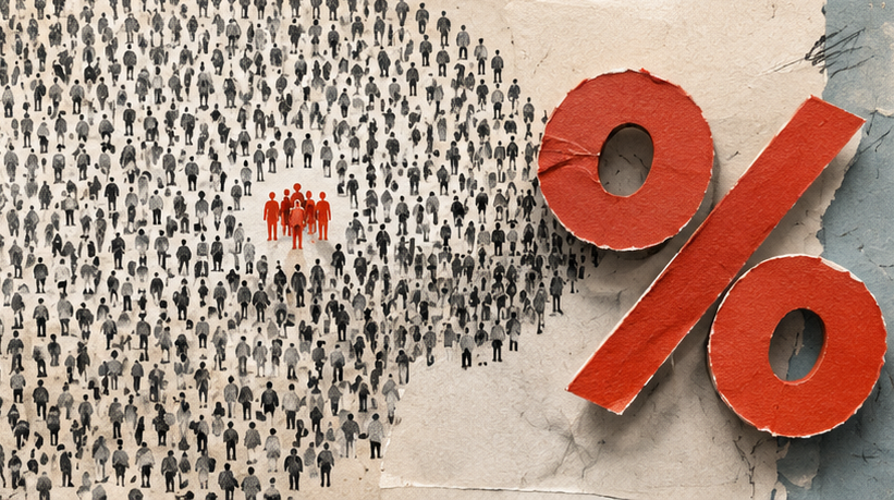
Research into health risk communication shows that how numbers are presented can influence understanding. A 2025 systematic review found that using the same group size when comparing risks makes comparisons easier. For example, showing 10 out of 100 people alongside 5 out of 100 is generally easier to interpret than comparing 10 out of 100 with 1 out of 20. [6]
Animation offers a way to make these relationships visible. It could show a population of 100,000 people, highlight the 100 initially affected, and then add the 30 additional cases. Viewers could see how a 30% relative increase translates into a much smaller absolute change. Similar visual comparisons could help explain the potential benefits and harms of different screening options.
But movement alone is not enough. Comparisons should remain visible long enough for viewers to examine, and the animation should be tested to establish whether people actually understand what the numbers mean.
3. Connect risk to the decisions people make
Understanding a risk is important, but people also need to know what it means for the decisions they face. When considering cancer screening, for example, they need to understand the available options, the potential benefits and harms, and why one approach might be recommended over another.
Research suggests that people make better-informed health decisions when they can clearly compare their options and understand the potential consequences of each. A Cochrane review of 209 studies involving 107,698 adults found that patient decision aids improved knowledge, helped people assess risks more accurately and probably helped them make choices that better reflected their personal values. [7]
A short video or animation could follow a person weighing a recommendation to change screening frequency, make the trade-offs explicit and end with questions to take to a clinician. It should leave room for a different reasonable choice where the evidence and circumstances allow one, and show what the risk means for the choices people face, including the potential benefits, harms and uncertainties.
The measure of success is not whether everyone agrees with the recommendation. It is whether people understand the evidence, can consider their options and are better equipped to make informed decisions that reflect their circumstances and values.
From explaining science to communicating risk
These three approaches suggest a broader role for video and animation in health communication. Start by understanding what the audience already believes. Make the risks and comparisons meaningful. Then connect that understanding to the decisions people face.
Animation has a demonstrated ability to improve knowledge and influence attitudes, cognition and behaviour. Its potential to help people reconsider risk deserves further exploration, careful design and evaluation. The question is not simply whether viewers remember the information, but whether they understand what it means for them.
Sources
[1] Moe-Byrne et al. (2026). How effective are video animations as information tools for patients and the general public? An updated systematic review. Frontiers in Digital Health, 7 (2025). Published 2 January 2026.
[2] Zhou and colleagues (2026). Australian perspectives towards genomics informed risk-based cancer screening programs: a focus group study. Journal of Community Genetics, 7 November 2026. Qualitative focus-group study.
[3] Does animation improve comprehension of risk information in patients with low health literacy? A randomized trial. Medical Decision Making, published online 3 December 2019. Randomised trial.
[4] Ancker and colleagues (2024). Insufficient evidence for interactive or animated graphics for communicating probability. Journal of the American Medical Informatics Association. Evidence review and perspective.
[5] Atman, Bostrom, Fischhoff and Morgan (1994). Designing risk communications: Completing and correcting mental models of hazardous processes, Part I. Risk Analysis. Methodological paper.
[6] How point (single-probability) tasks are affected by probability format, Part 1: A Making Numbers Meaningful systematic review. MDM Policy & Practice, 2025. Systematic review.
[7] Stacey and colleagues (2024). Decision aids for people facing health treatment or screening decisions. Cochrane Database of Systematic Reviews, 2024. Systematic review.